TYPE III
INTERACTIVE WEB & BRAND IDENTITY
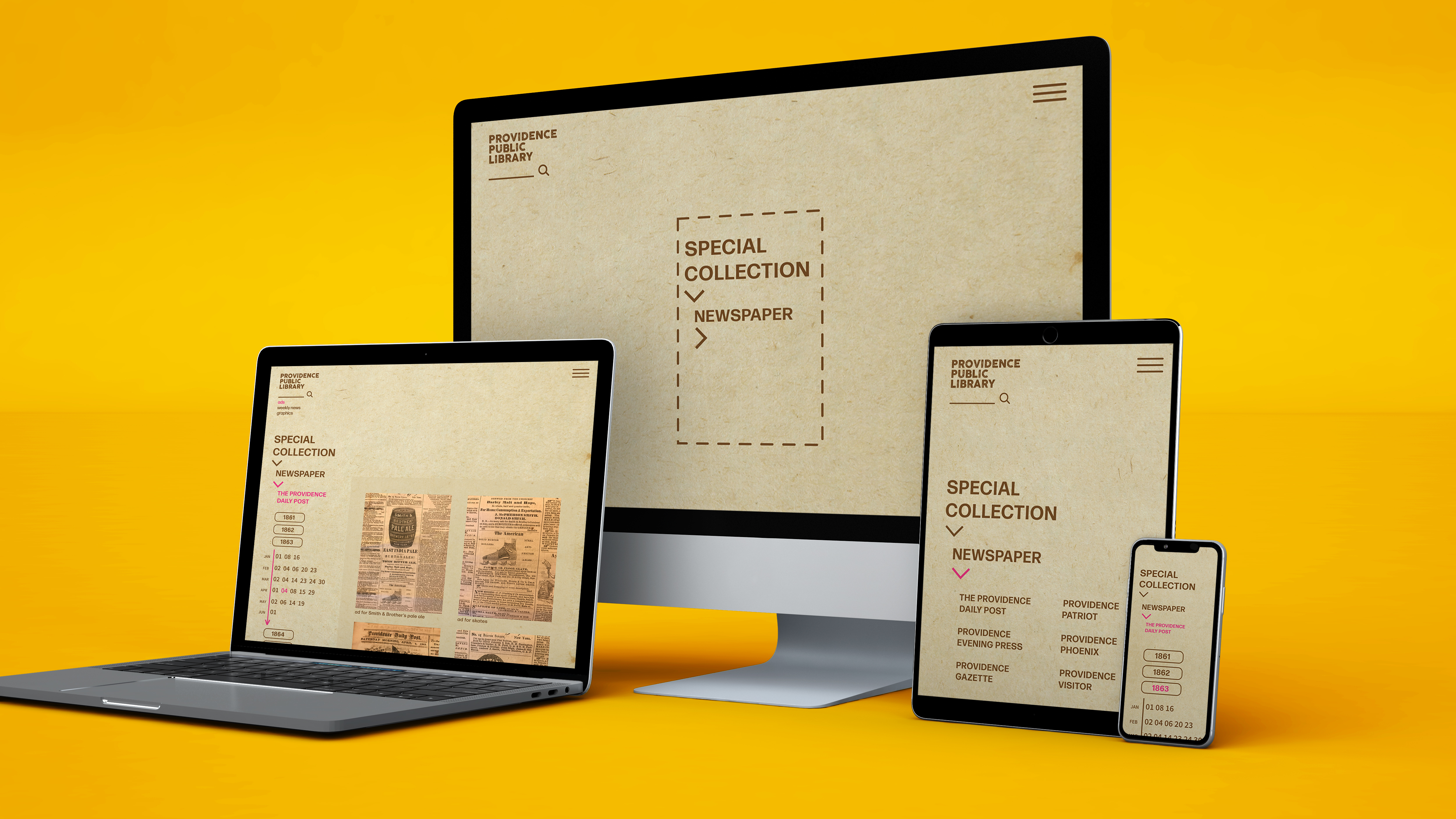
The interactive web is created in collaboration with the Providence Public Library’s (PPL) Special Collection. The rebranded web focuses on reimagining the way to systemize a large and dense collection. In this instance, it catalogues and organizes 19th century American Newspapers. The prototype is created in Adobe XD and includes variations to fit mobile, tablet, and computer screens as well as landscape views. The ultimate goal was to produce a consistent yet flexible system.
KEY VISUAL ELEMENTS
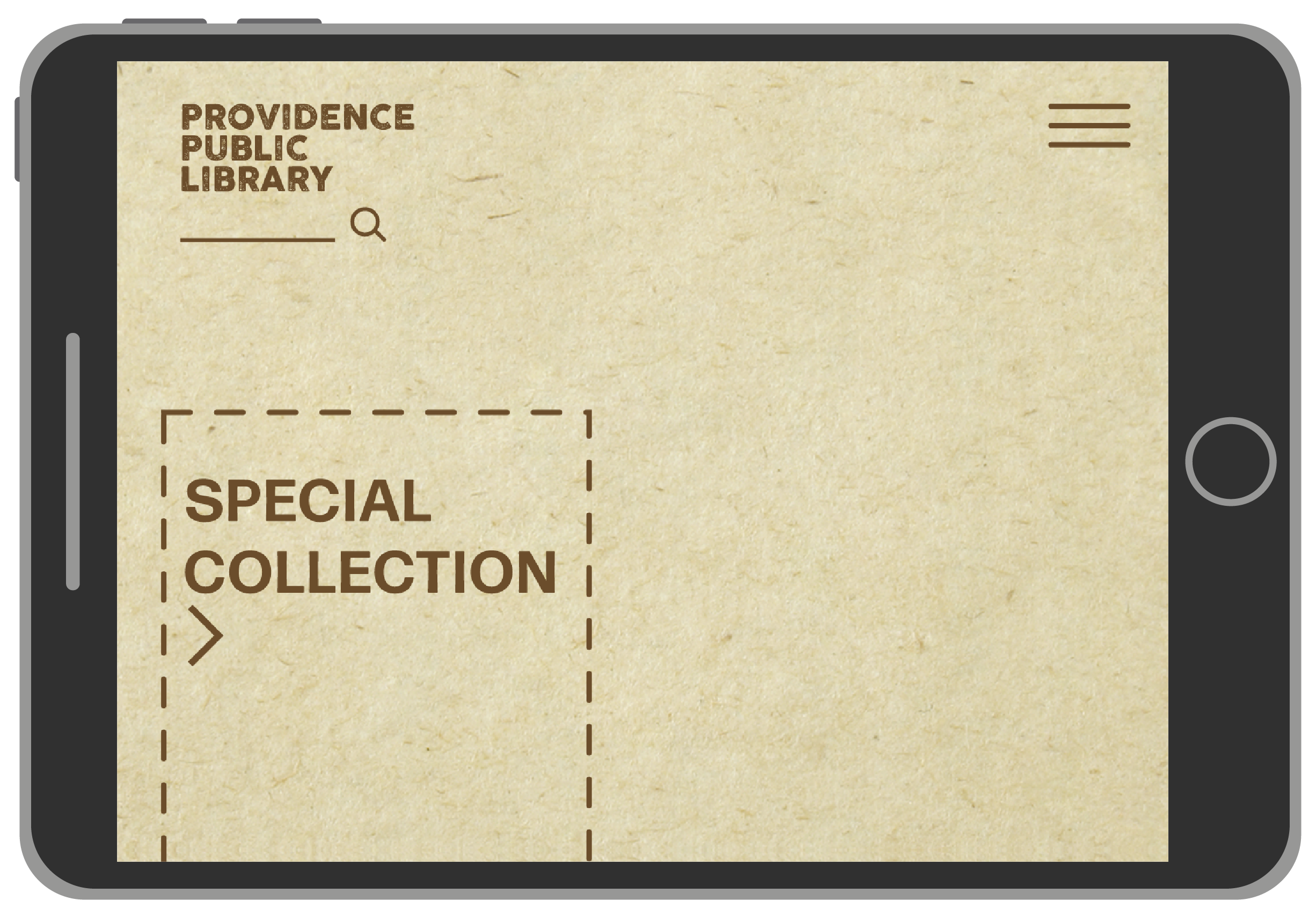
Visuals of the tab system derive from the arrowed lines that are often used for timelines. The dashed frame on the home page lends its proportion from actual measurements of 19th century newspapers. Choice in a neutral beige and brown palette as well as a subtle textured background is reminiscent of faded paper. The pop of pink serves to highlight and guide the eyes. The typefaces Cocogoose Letterpress is used for titles, Forma DJR Deck for copy, and Source Sans Variable for numbers.
Visuals of the tab system derive from the arrowed lines that are often used for timelines. The dashed frame on the home page lends its proportion from actual measurements of 19th century newspapers. Choice in a neutral beige and brown palette as well as a subtle textured background is reminiscent of faded paper. The pop of pink serves to highlight and guide the eyes. The typefaces Cocogoose Letterpress is used for titles, Forma DJR Deck for copy, and Source Sans Variable for numbers.
STRUCTURE & MOTION: PHONE VS TABLET
Because of the small screen size, the phone is designed with a one column grid so as to allow for the easy motion of swiping up and down and also viewing the information clearly. The mobile structure lended it designs to the overall concept of stacking and top-down hierarchy.
Going into the tablet design, with a bit more space, two columns are used, with the primary motion being up and down, and left and right columns introducing horizontal swiping motions.
STRUCTURE & MOTION: TABLET VS DESKTOP
For the laptop version, three columns are introduced, with the left hand acting more as a guide bar of information such as where one is at on the website— the year, month, and date etc. One mainly navigates and looks through the images from the right hand side. Furthermore, since there is ample space, all the images are displayed at once, allowing for a quick and complete overview of the information.
For the laptop version, three columns are introduced, with the left hand acting more as a guide bar of information such as where one is at on the website— the year, month, and date etc. One mainly navigates and looks through the images from the right hand side. Furthermore, since there is ample space, all the images are displayed at once, allowing for a quick and complete overview of the information.

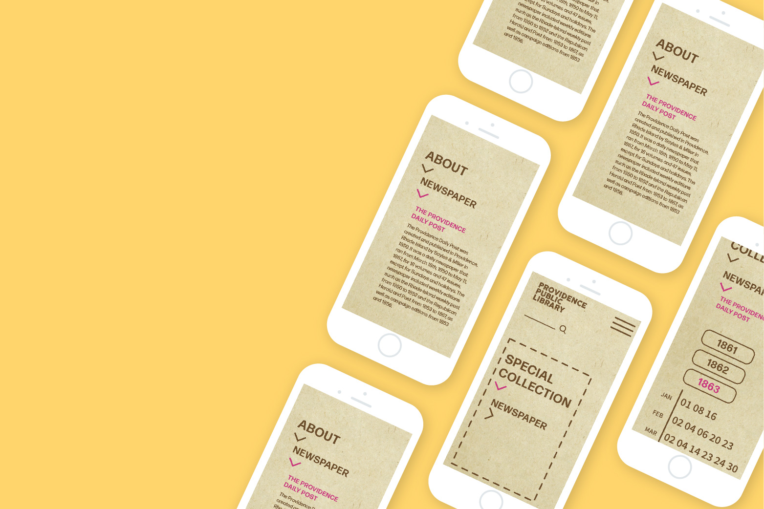
LANDSCAPE VIEW FOR MOBILE & TABLET
The layout becomes more tight and condensed to accommodate the limited vertical space in landscape views in either mobile or tablets. Yet, the layout maintains its consistency and cohesiveness.
The layout becomes more tight and condensed to accommodate the limited vertical space in landscape views in either mobile or tablets. Yet, the layout maintains its consistency and cohesiveness.
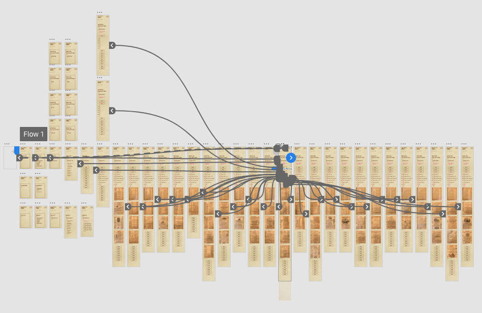
PROCESS
Wireframing workflow for the portrait mobile view in Adobe XD.
Wireframing workflow for the portrait mobile view in Adobe XD.