DESIGN STUDIO IV
KNOLL BRANDING
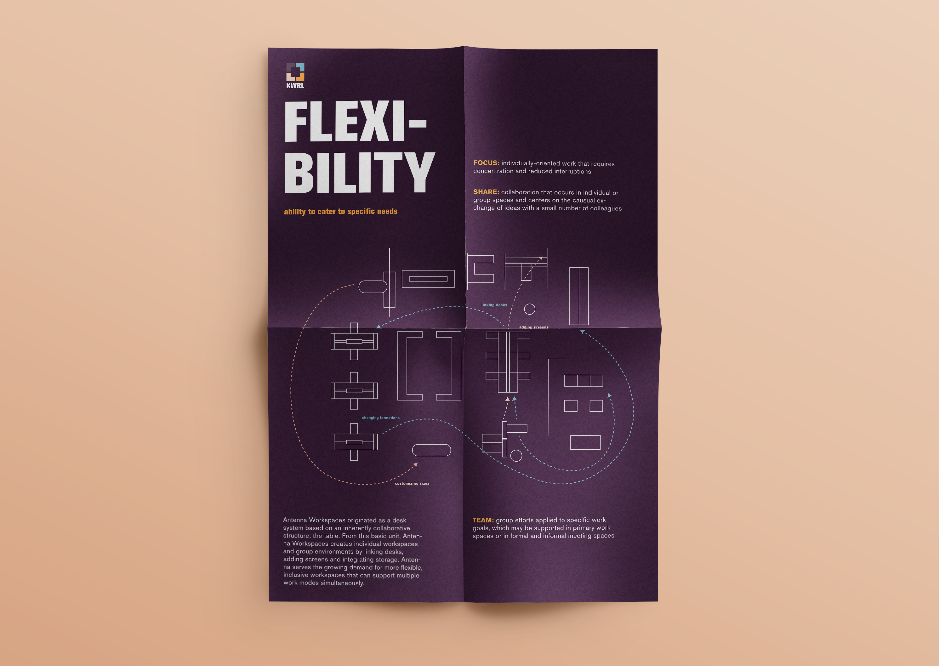
The brand identity project serves to mimic a remote, freelance, project for a real-life client and prompt, in this case Knoll and more specifically the Koll Workplace Research Library (KWRL). In order to develop a logo that perfectly represents some of KWRL’s practices, Antenna Workplaces, one of Knoll’s research papers, inspires the ideation and rebrand.
LOGO IN MOTION
The logo highlights Antenna Workplace’s modular system as office furniture translates to nearly limitless configurations with different leg types and heights as well as worksurfaces in various shapes and sizes. The color choice consists of a muted and toned down palette that represent soothing yet sharp colors that is perfect for the office space and works well as either a singular or combined color story.
LOGO DESIGN GUIDE
The style guide details the color specifications, typeface choice, form-making, color treatment. As Akzidenz Grotesk influenced the creation of one of the most known and widely used fonts—Helvetica, even in Knoll’s own logo, KWRL thus uses the font to showcase the company’s roots and values based on research and science.
The style guide details the color specifications, typeface choice, form-making, color treatment. As Akzidenz Grotesk influenced the creation of one of the most known and widely used fonts—Helvetica, even in Knoll’s own logo, KWRL thus uses the font to showcase the company’s roots and values based on research and science.
POSTER
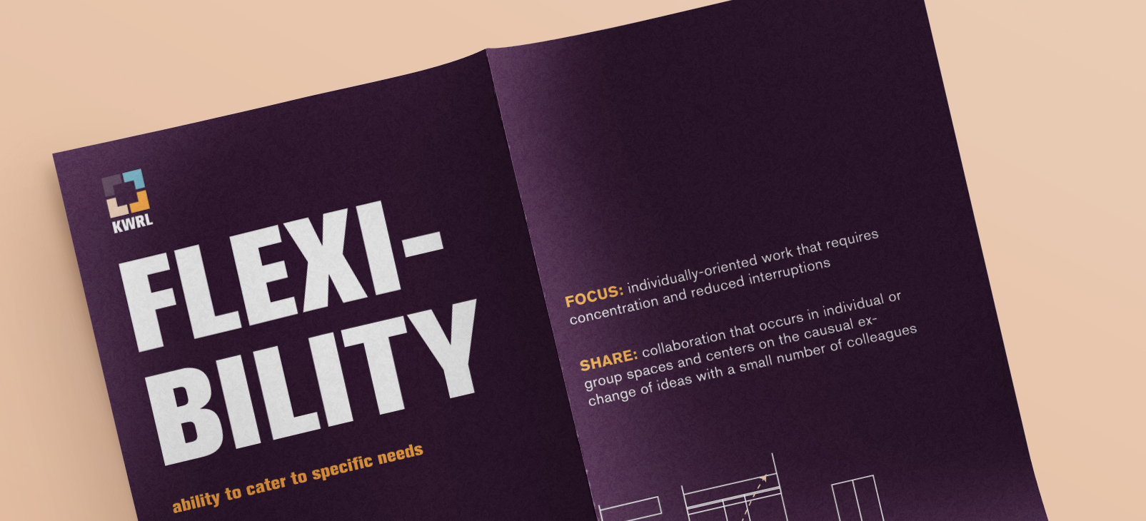
The key components of modularity, flexibility, and choice are represented in poster form.
The key components of modularity, flexibility, and choice are represented in poster form.