TYPE II
LOUISE BOURGEOIS’ WRITINGS
The book interlaces Bourgeois’ own writings, extracted from diaries, letters, notebooks, and published writings, with writings by critics of hers. Widely known for her large scale sculptures and installations, the book instead focuses on her personal writings and psychoanalysis journey. The collected writings unveil a different and in depth understanding of the themes of domesticity, sexuality, and death in her works. The book recreates the delicate, handmade, and emotional qualities—consistently transparent throughout Bourgeois’ work—of a personal container for writings. A poster and an animated gif accompany the book, and all elements of the system utilize the display typeface I created.

SPREADS
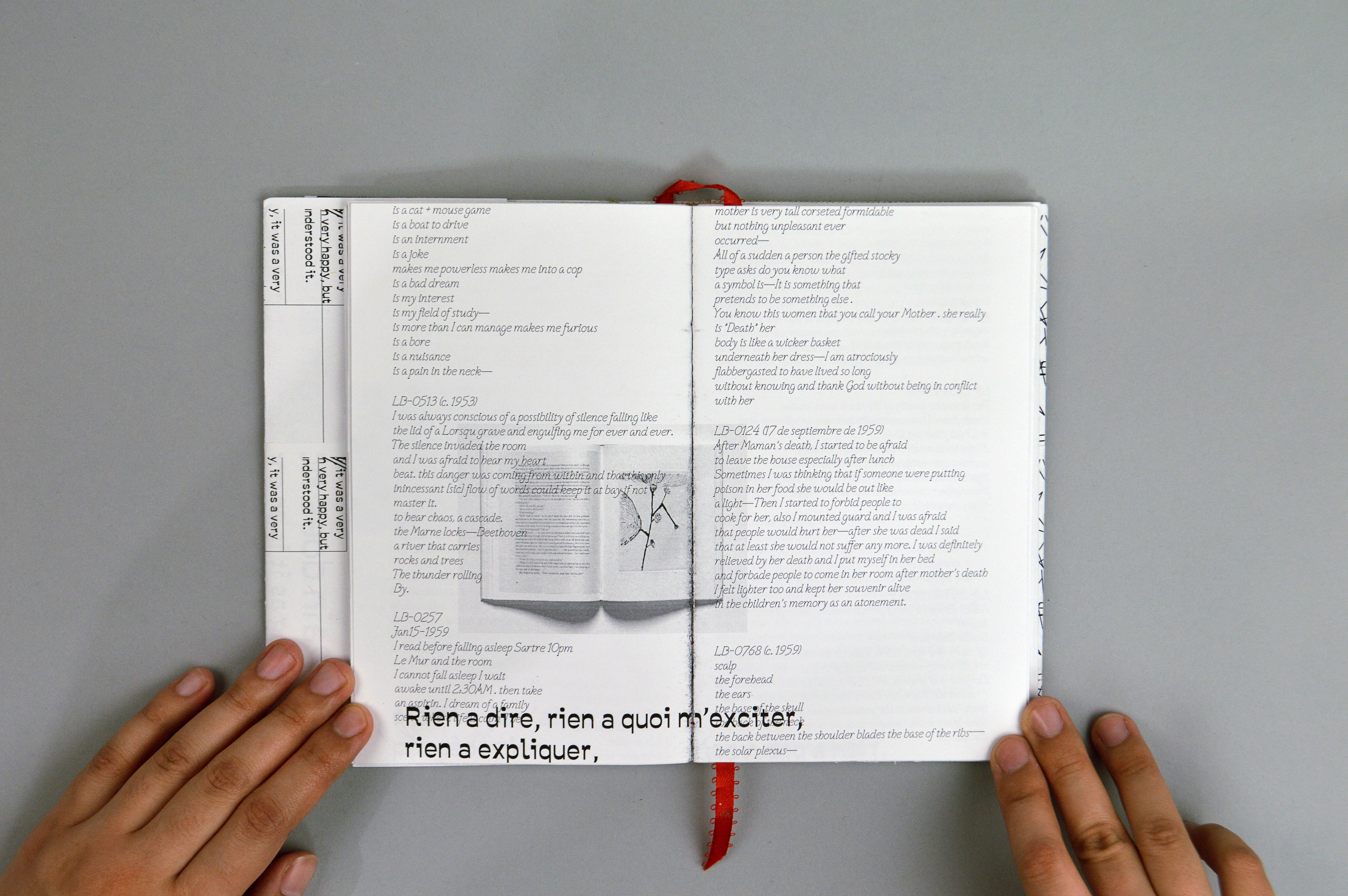
The layout follows the somewhat erratic yet ordered organization of journals and diaries. Content on black dividers alternate between the right and left of the spread, and they signal the beginning of a new section.
The layout follows the somewhat erratic yet ordered organization of journals and diaries. Content on black dividers alternate between the right and left of the spread, and they signal the beginning of a new section.

DISPLAY TYPEFACE
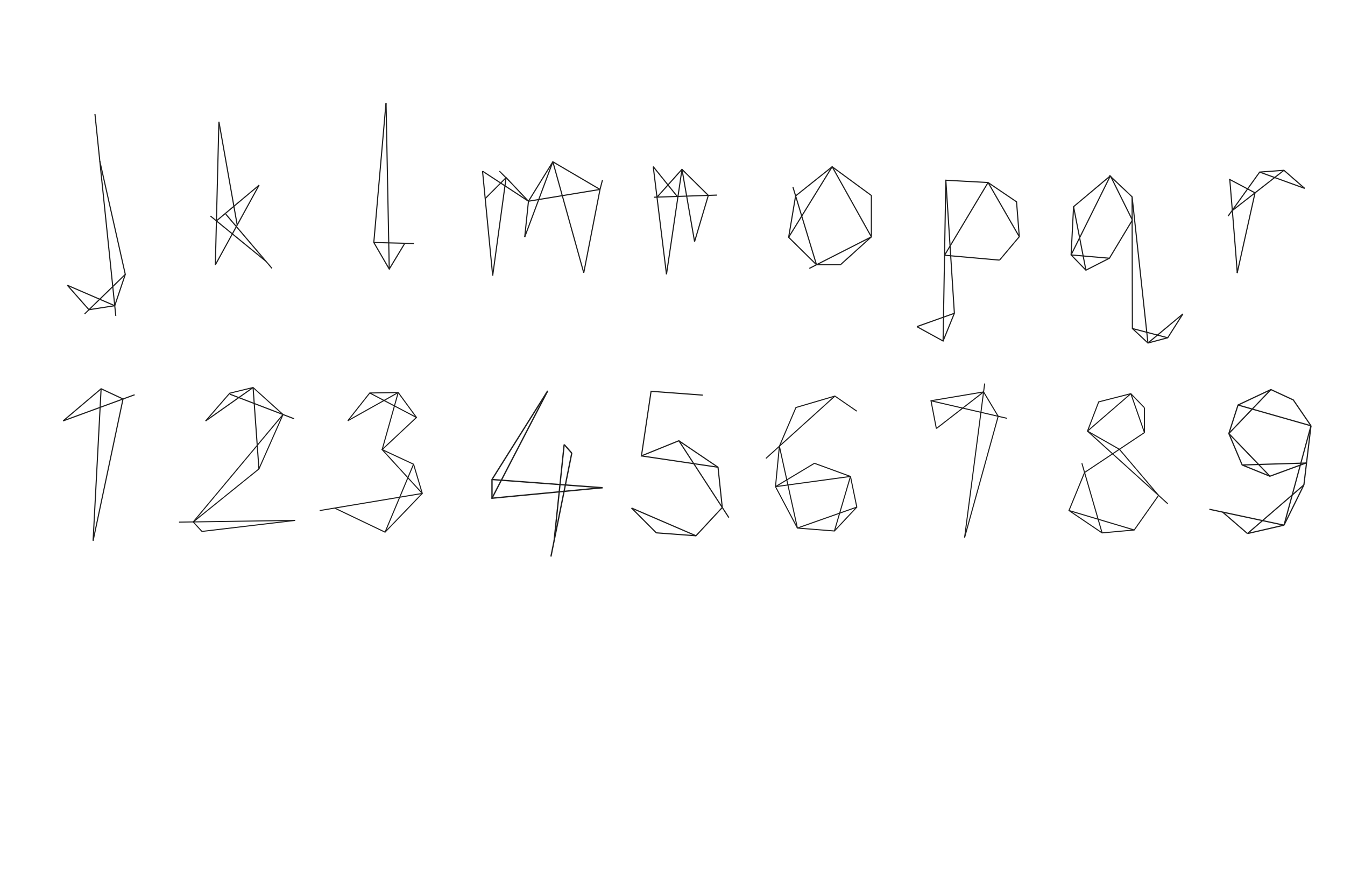
A display typeface is created that is inspired by the geometric line qualities in Bourgeois’ illustrations, drawings, and doodles.
A display typeface is created that is inspired by the geometric line qualities in Bourgeois’ illustrations, drawings, and doodles.

EXAMPLE SPREAD
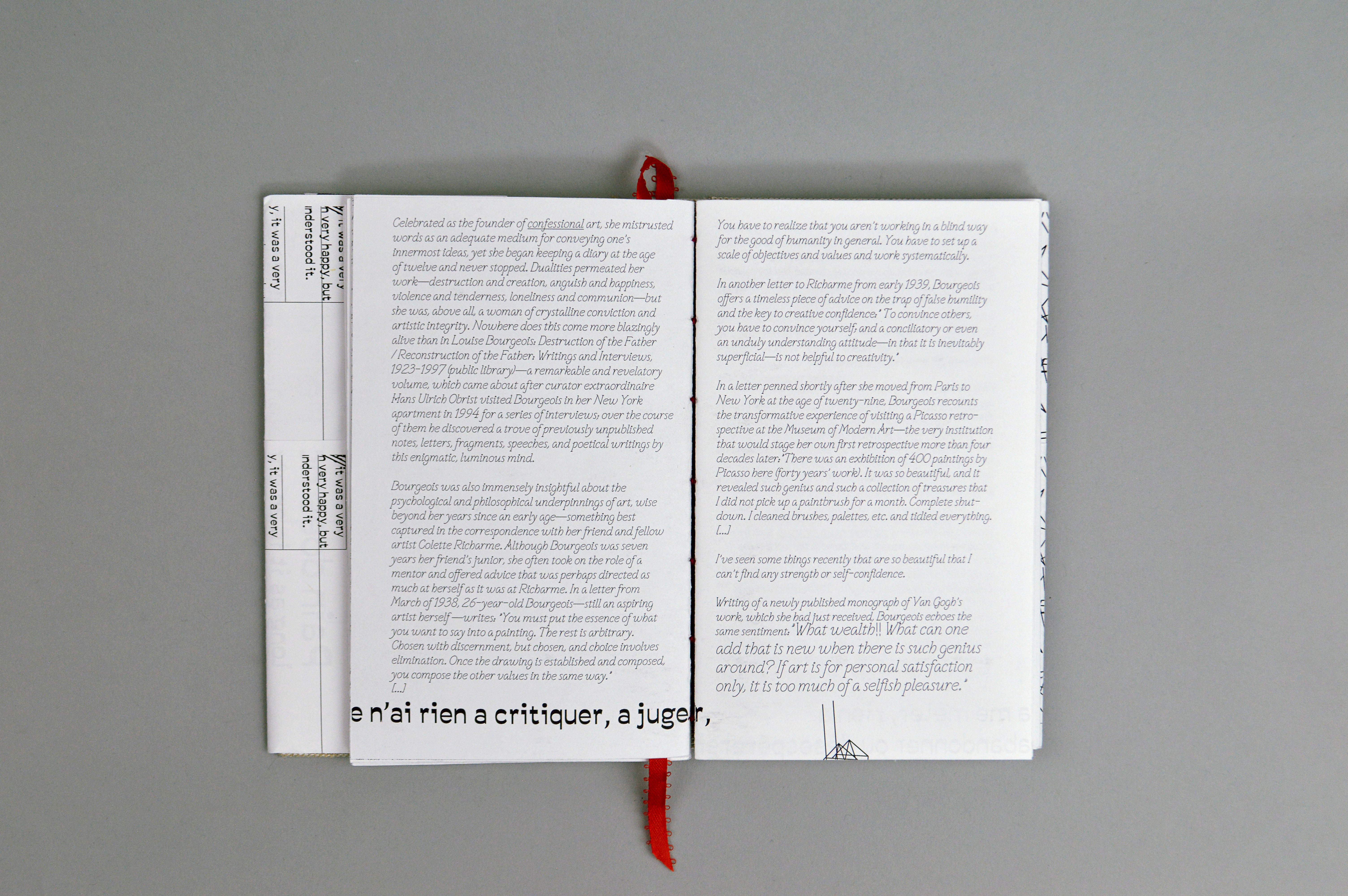
This spread serves as an example of this book’s “delicate, handmade, and emotional” qualities mentioned above. The copy uses the typeface Victorianna while titles, page numbers, and lines of Bourgeois’ poem, “Ode to My Mother,” which appear on the bottom of the spread, uses Savate. Both from the Velvetyne Type Foundry, the two typefaces display contrast that are reminiscent of handwritten forms.
Furthermore, Bourgeois’s own writings and voice are highlighted by the larger point size whereas underlined parts demonstrate areas I, as the curator, believe are important and intriguing.
Choices were made so that readers may be guided by visual elements of the book. A reader may follow along the book sequentially or open to any page and discover something new and interesting.
BOOK COVER & INSERT
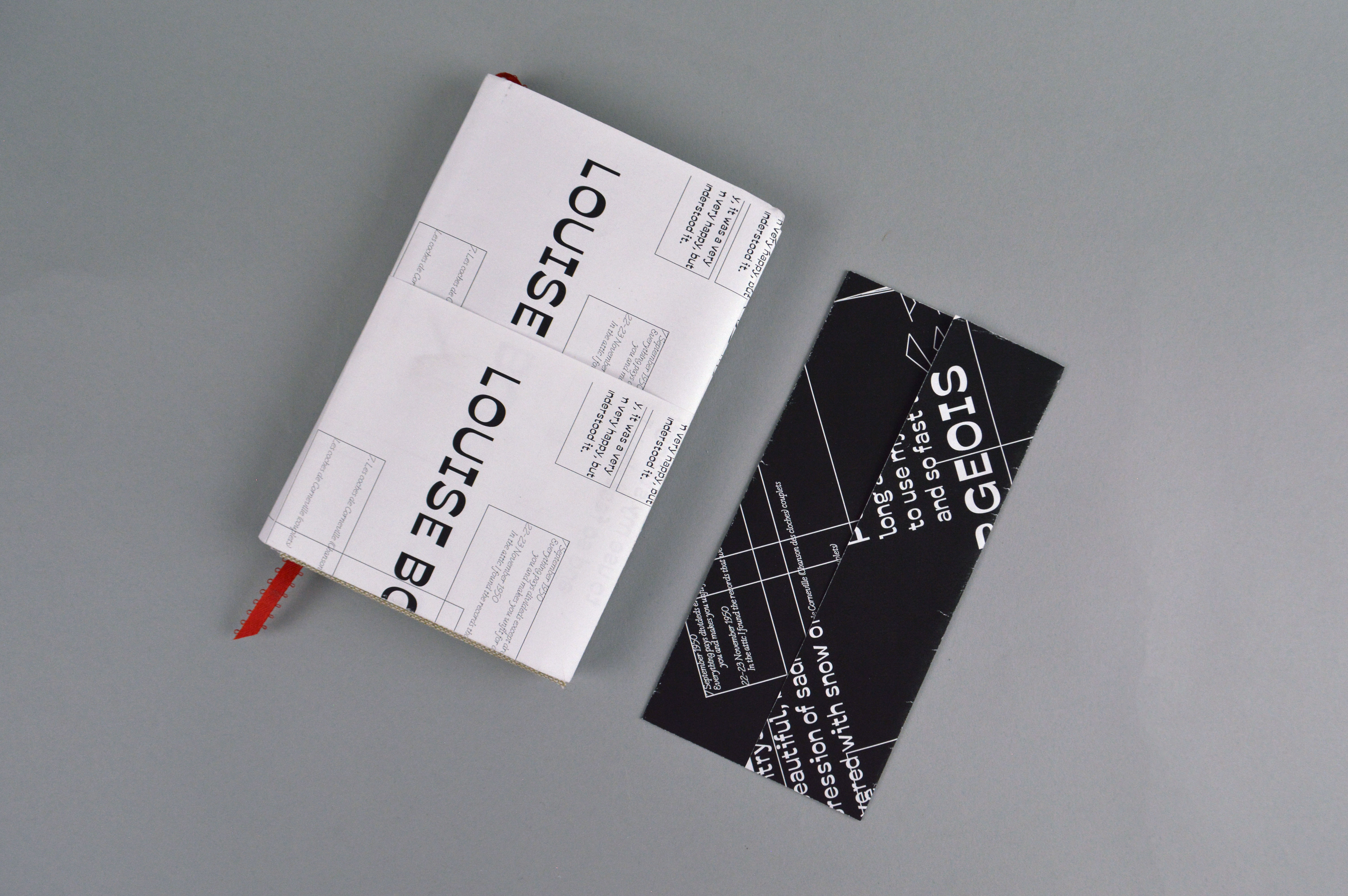
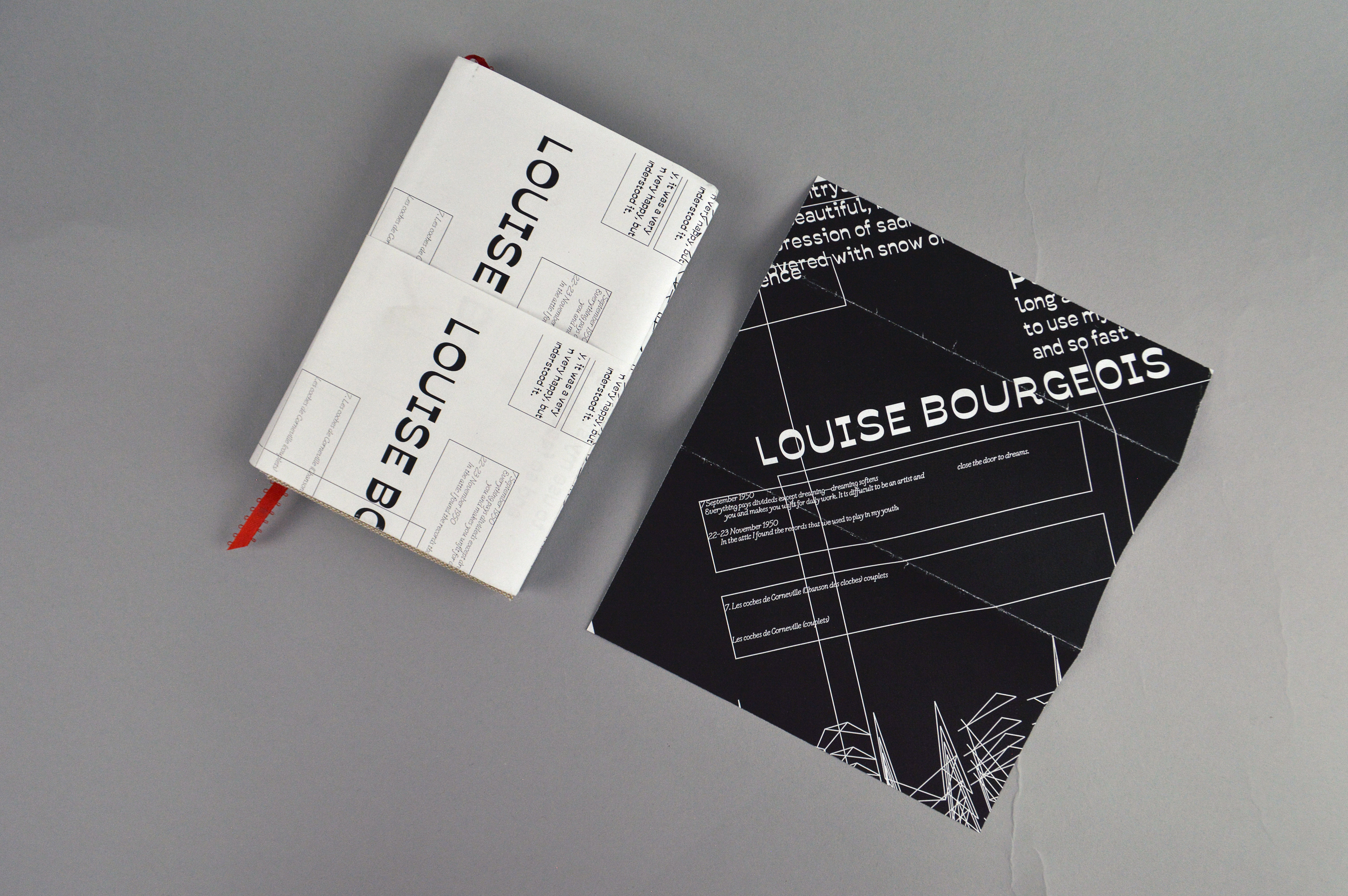
A mini poster folds out after taking it out from the pocket insert. Inverted colors, the cover and poster maintain the black and white color palette within the book.
A mini poster folds out after taking it out from the pocket insert. Inverted colors, the cover and poster maintain the black and white color palette within the book.
POSTER TO GIF
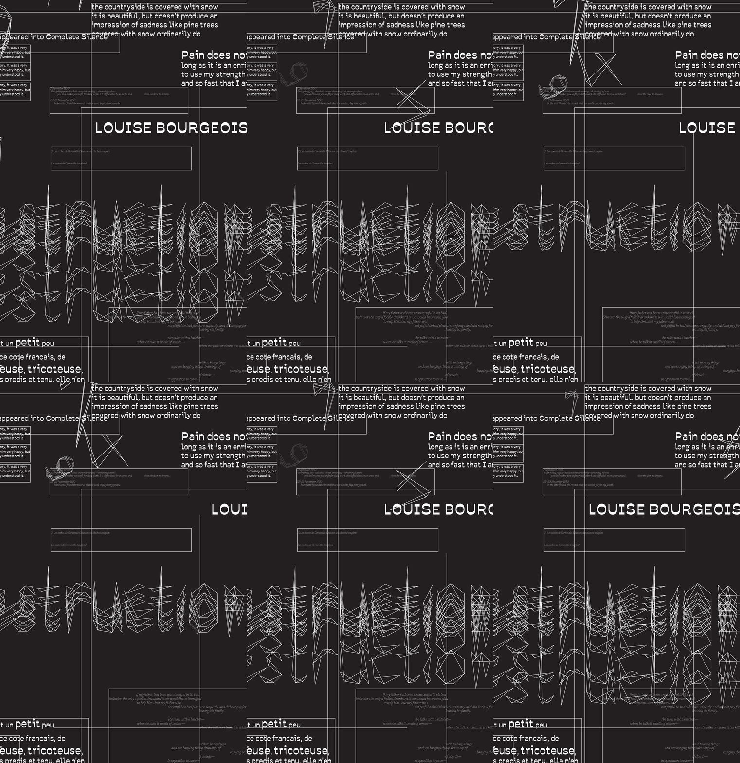
The animated gif again retain qualities of Bourgeois’ work through its motion.
The animated gif again retain qualities of Bourgeois’ work through its motion.